Exploratory Data Analysis of dataset #1
Overview
Teaching: 15 min
Exercises: 30 minQuestions
What are the main explorary data analysis step to perform?
What would you do to compare the different tissues all at once?
How would you already get an idea of the similarity between tissues?
Objectives
Reckon the value of EDA to get a better understanding of a dataset.
Identify potential issues in this dataset.
Table of Contents
- 1. What is Exploratory Data Analysis?
- 2. Data import sanity checks
- 3. Data exploration
- 4. Describing relationships between the different variables
- References
1. What is Exploratory Data Analysis?
EDA (short for Exploratory Data Analysis) can have different purposes:
- Handle Missing values.
- Removing duplicates.
- Outlier Treatment.
- Normalizing and Scaling( Numerical Variables).
- Encoding Categorical variables( Dummy Variables).
- Bivariate Analysis.
Here, we are not going to do all of this. Instead, we will perform some data import checks, plotting some statistics and get an idea of how each tissue relates to each other.
2. Data import sanity checks
First, create a data/ folder in your working directory. For instance, if you are working on your Desktop, then your R working directory should be ~/Desktop/ at the top of your R console (bottom-left panel). Your data directory
You can also check this within R using the getwd() command.
getwd()

# create the data/ folder
dir.create("data/")
# download the gene expression dataset from Zenodo
# this writes it to your hard drive
download.file(url = "https://zenodo.org/record/4068261/files/GTEx_Analysis_2016-01-15_v7_RNASeQCv1.1.8_gene_median_tpm.tsv?download=1",
              destfile = "data/GTEx_Analysis_2016-01-15_v7_RNASeQCv1.1.8_gene_median_tpm.tsv",
              method = "wget",
              quiet = TRUE)

# import into R working memory as an R object
df_expr <- read.delim(file = "data/GTEx_Analysis_2016-01-15_v7_RNASeQCv1.1.8_gene_median_tpm.tsv",
                 header = TRUE,
                 stringsAsFactors = FALSE,
                 check.names = FALSE)
You can already check the number of rows (genes) and columns (tissues/samples) using simple R functions:
# number of rows / columns
nrow(df_expr)
ncol(df_expr)
This should give you 56,202 genes (probes) and 53 tissues (55 -2 columns: gene id and description).
How did R “understand” your different data types?
str(df)
This command will output this in your console:
Rows: 56,202
Columns: 55
$ gene_id                                     <chr> "ENSG00000223972.4", "ENSG00000227232.4", "ENSG00000243…
$ Description                                 <chr> "DDX11L1", "WASH7P", "MIR1302-11", "FAM138A", "OR4G4P",…
$ `Adipose - Subcutaneous`                    <dbl> 0.056945, 11.850000, 0.061460, 0.038600, 0.035695, 0.04…
$ `Adipose - Visceral (Omentum)`              <dbl> 0.05054, 9.75300, 0.05959, 0.03245, 0.00000, 0.03988, 0…
$ `Adrenal Gland`                             <dbl> 0.074600, 8.023000, 0.081790, 0.040500, 0.034790, 0.049…
$ `Artery - Aorta`                            <dbl> 0.03976, 12.51000, 0.04297, 0.02815, 0.00000, 0.03399, …
$ `Artery - Coronary`                         <dbl> 0.04386, 12.30000, 0.05848, 0.03678, 0.00000, 0.00000, …
$ `Artery - Tibial`                           <dbl> 0.04977, 11.59000, 0.05184, 0.03894, 0.00000, 0.04286, …
...(more lines)
Question
- Did R convert the “gene_id” column to a suitable data type?
- Did R convert all the other columns to a suitable data type?
Solution
- Yes, R has converted the “probe” column into the
chrdata type which stands for character. This is because we specifystringsAsFactors = FALSEin theread.csv()function at the beginning.- Yes, all tissue columns with gene expression measurements have been converted to the
dbldata type which stands for “double class” (a double-precision floating point number). In short, it is a number with decimals.
head(n = 5)
For big matrix, do df_expr[1:5,1:5] to show the first five lines and five columns for instance.
Tip
A much more complete view of the data can be obtained with the
skim()function from theskimrpackage.
Try it:skim(df_expr)
3. Data exploration
3.1 Simple statistical metrics
EDA helps to get a better understanding of the studied dataset and preparing its downstream analysis (e.g. fitting a regression model). We are first going to compute a few descriptive metrics followed by some plotting.
Question
Calculate a series of descriptive metrics on the expression value for all tissues:
- minimumn
- maximum
- average
- median
Hint: make your dataset tidy first with
pivot_longerand use the%>%operator to chain operations on your dataframe.Solution
df_expr %>%
  pivot_longer(cols = - c(gene_id, Description),
               names_to = "tissue",
               values_to = "expression") %>%
  summarise(max = max(expression),
            min = min(expression),
            average = mean(expression),
            median = median(expression)
            )
This gives you the following results:
# A tibble: 1 x 4
     max   min average median
   <dbl> <dbl>   <dbl>  <dbl>
 246600  0    16.6    0.00490
Discussion
- What do these gene expression metrics tell you about the spread of data?
- Do you think it can have an influence on data representation? If yes, what sort of bias can it introduce?
Solution
- As the maximum value is equal to 246,600 and the minimum to 0, these data are heavily spread on several orders of magnitude.
- Since you will have to represent gene expression values using a common scale, it might be difficult to represent both low and very high expression values. One solution is to scale data or to use a transformation e.g. \(log_{10}\).
3.2 Simple graphical descriptions
One tissue
Since a picture is worth a thousand word, we can generate a few plots to describe our gene expression values, in particular in a tissue-specific way.
First, we need to make our dataframe tidy and save it under a new name (df_tidy). Let’s do it like this:
df_tidy <- df_expr %>%
  pivot_longer(cols = - c(gene_id, Description),
               names_to = "tissue",
               values_to = "expression")
Let’s start simple! Let’s plot the distribution of gene expression values from one tissue as a boxplot. A boxplot shows the distribution of continuous values, its four quartiles and possible outliers:
- Minimum : the lowest data point excluding any outliers.
- Maximum : the largest data point excluding any outliers.
- Median (Q2 / 50th percentile) : the middle value of the dataset.
- First quartile (Q1 / 25th percentile) : also known as the lower quartile qn(0.25), is the median of the lower half of the dataset.
- Third quartile (Q3 / 75th percentile) : also known as the upper quartile qn(0.75), is the median of the upper half of the dataset.
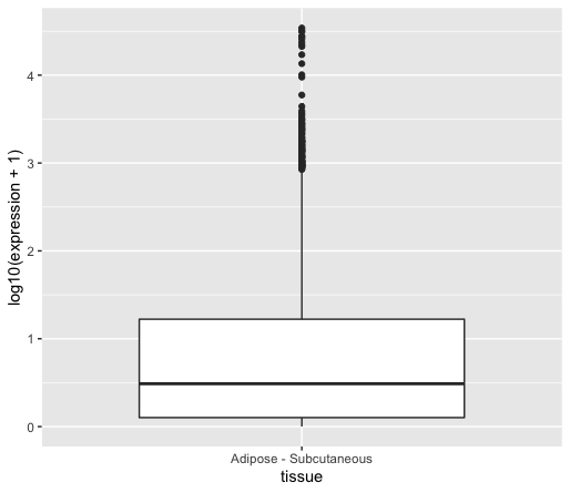
df_tidy %>%
  dplyr::filter(tissue == "Adipose - Subcutaneous") %>% # the dplyr:: notation makes sure the filter function comes from the dplyr package
  ggplot(data = ., aes(x = tissue, y = expression)) +
    geom_boxplot()
This will give you the following plot:

As you can see, we can retrieve the issue of displaying highly expressed genes together with lowly expressed genes.
Question
Within
ggplot, find a way to show both low and high gene expression values altogether. Hint: log10 transform theyvariable inaes().Solution
df_tidy %>%
  dplyr::filter(tissue == "Adipose - Subcutaneous") %>%   # the dplyr:: notation makes sure the filter function comes from dplyr
  ggplot(data = ., aes(x = tissue, y = log10(expression + 1)) + #  add 1 to the values to avoid -Inf when using $$log_{10}$$ transformation
    geom_boxplot()
You could also remove the gene values equal to 0 by adding a dplyr::filter(expression != 0) line before the ggplot() call.
You can see that the median is now visible since further away from zero.
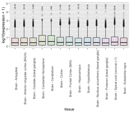
Multiple tissues
Let’s now see how these different samples compare to each other in terms of tissue expression.
Instead of plotting all tissues, let’s plot all brain tissues using a filter function call.
df_tidy %>%
  dplyr::filter(expression != 0) %>%
  filter(grepl(pattern = "Brain*", x = tissue)) %>%
  ggplot(data = ., aes(x = tissue, y = log10(expression + 1), fill = tissue)) +
    geom_boxplot(alpha = 0.1) +
    theme(axis.text.x = element_text(angle = 90)) +
    guides(fill=FALSE)
Discussion
Try to plot all tissues and not only brain tissues, what issue do you see?
While boxplots are useful to display a few key metrics, it is hard to compare tissues to each other. Instead, we can overlay distributions on top of each others to identify potential deviant tissues.
df_tidy %>%
  mutate(log_expression = log10(expression)) %>%     # another way to log-transform your data before plotting
  ggplot(data = ., aes(x = log_expression, fill = tissue)) +
    geom_density(alpha = 0.1) +
    theme(axis.text.x = element_text(angle = 90)) +
    guides(fill=FALSE)
4. Describing relationships between the different variables
A great way to visualise similar patterns from high-dimensional data is to create so-called pairwise plot matrix to compare all tissues to each other in a comprehensive way. Since we have 53 tissues, we could plot a 53 x 53 matrix but this requires some computational time. Instead, we are going to visualise similar and dissimilar tissues 3 tissues at a time (3 x 3 pairwise plot matrix).
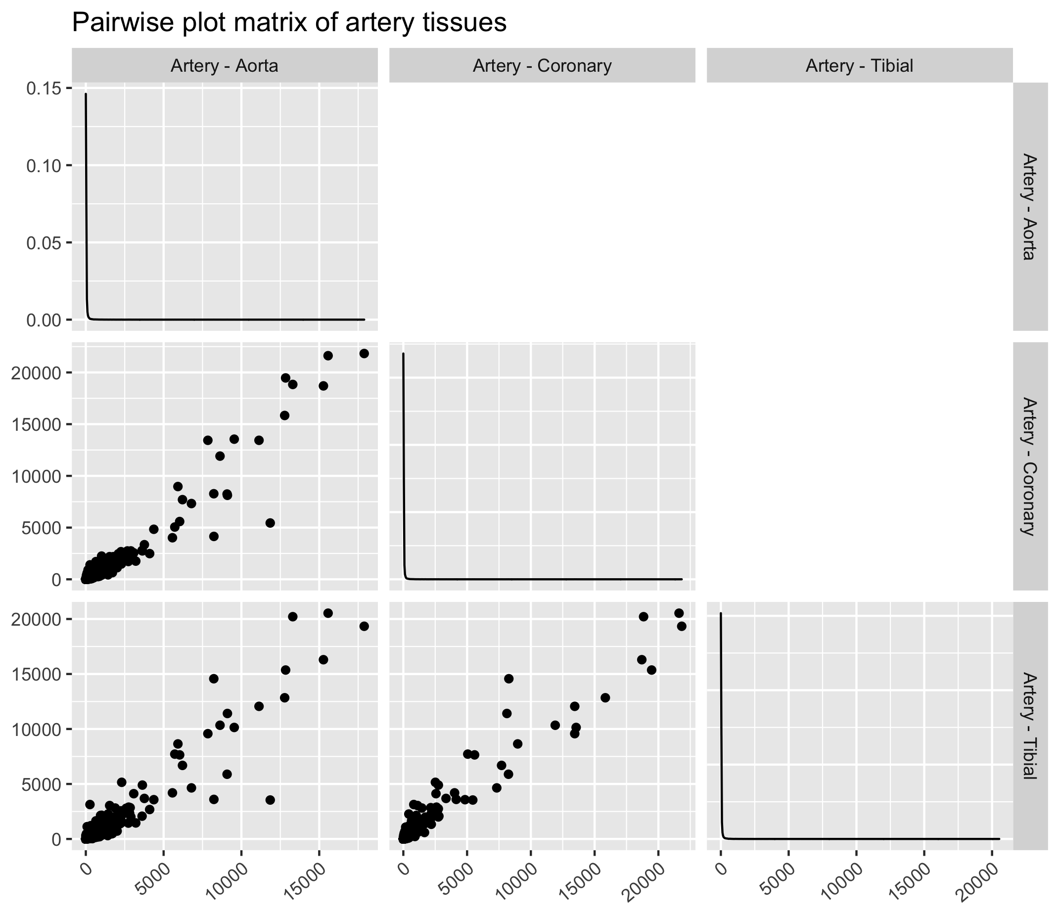
4.1 Similar tissues (artery)
Similar tissues exhibit comparable gene expression patterns as it can be seen from the figure below. Here we will use the ggpairs function from the GGally ggplot extension. In order to use ggpairs, we will have to make the dataframe “wide” again using pivot_wider() for the ggpairs function to work.
Also, we will filter tissues based on a regular expression (Artery*) so that only tissue names with “artery” in their name are kept.
df_tidy %>%
  dplyr::filter(expression != 0) %>%
  filter(grepl(pattern = "Artery*", x = tissue)) %>%
  pivot_wider(id_cols = c(gene_id, Description), names_from = tissue, values_from = expression) %>%
  dplyr::select(- gene_id, - Description) %>%  # as ggpairs only accept numerical values
  ggpairs(title = "Scatterplot matrix of artery tissues", upper = "blank") +
  theme(axis.text.x = element_text(angle = 40, hjust = 1, vjust = 1))
Exercise
Try to plot other tissue types based on a regular expression. You can try “Esophagus*” or “Brain*” for instance.
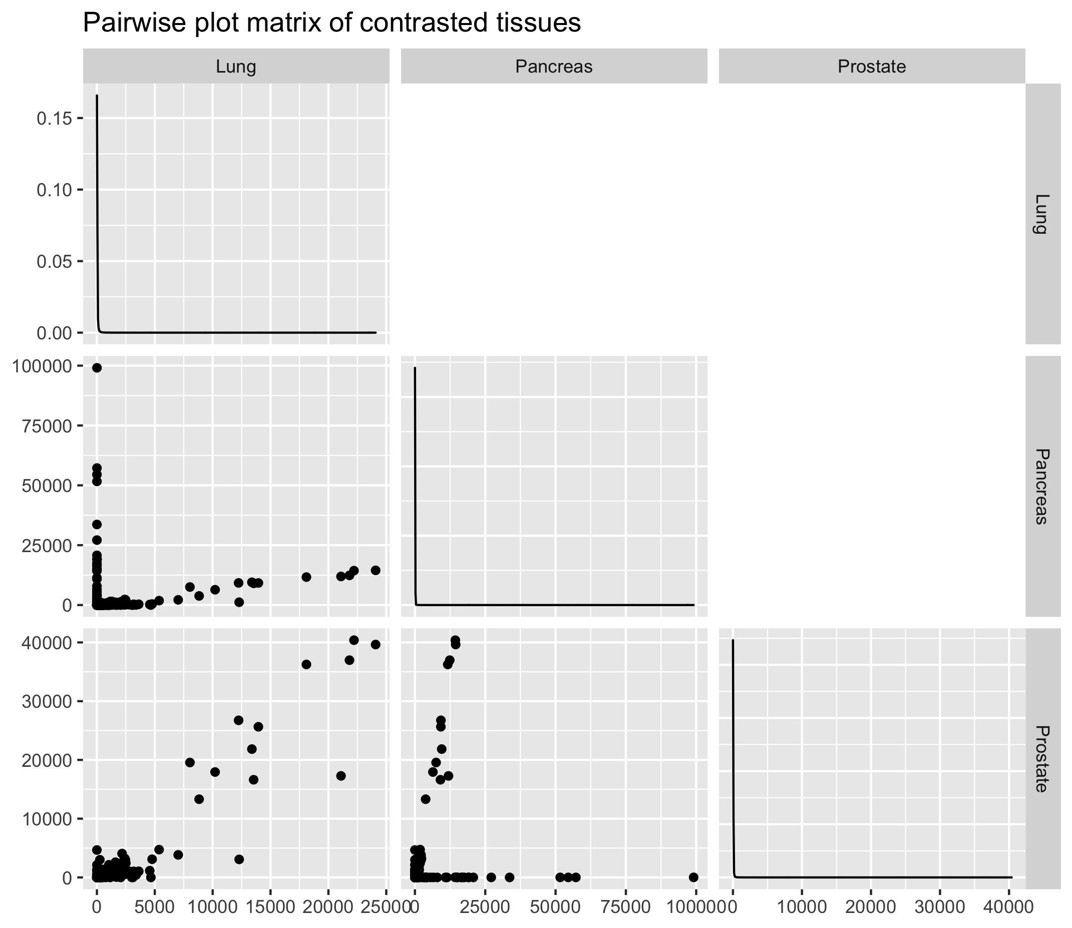
4.2 Dissimilar tissues (lung, prostate and pancreas)
On the contrary, some tissues will exhibit contrasted gene expression profiles. Let’s try with tissues that intuitively should be different i.e. the lungs, prostate and pancreas.
References
Key Points
Computing several descriptive metrics and distribution plots is important to visualise value distributions and potential outliers.
Scaling is necessary to visualise values that show value differences of several order of magnitude.
A pairwise plot matrix can help to pinpoint samples with similar gene expression profiles.